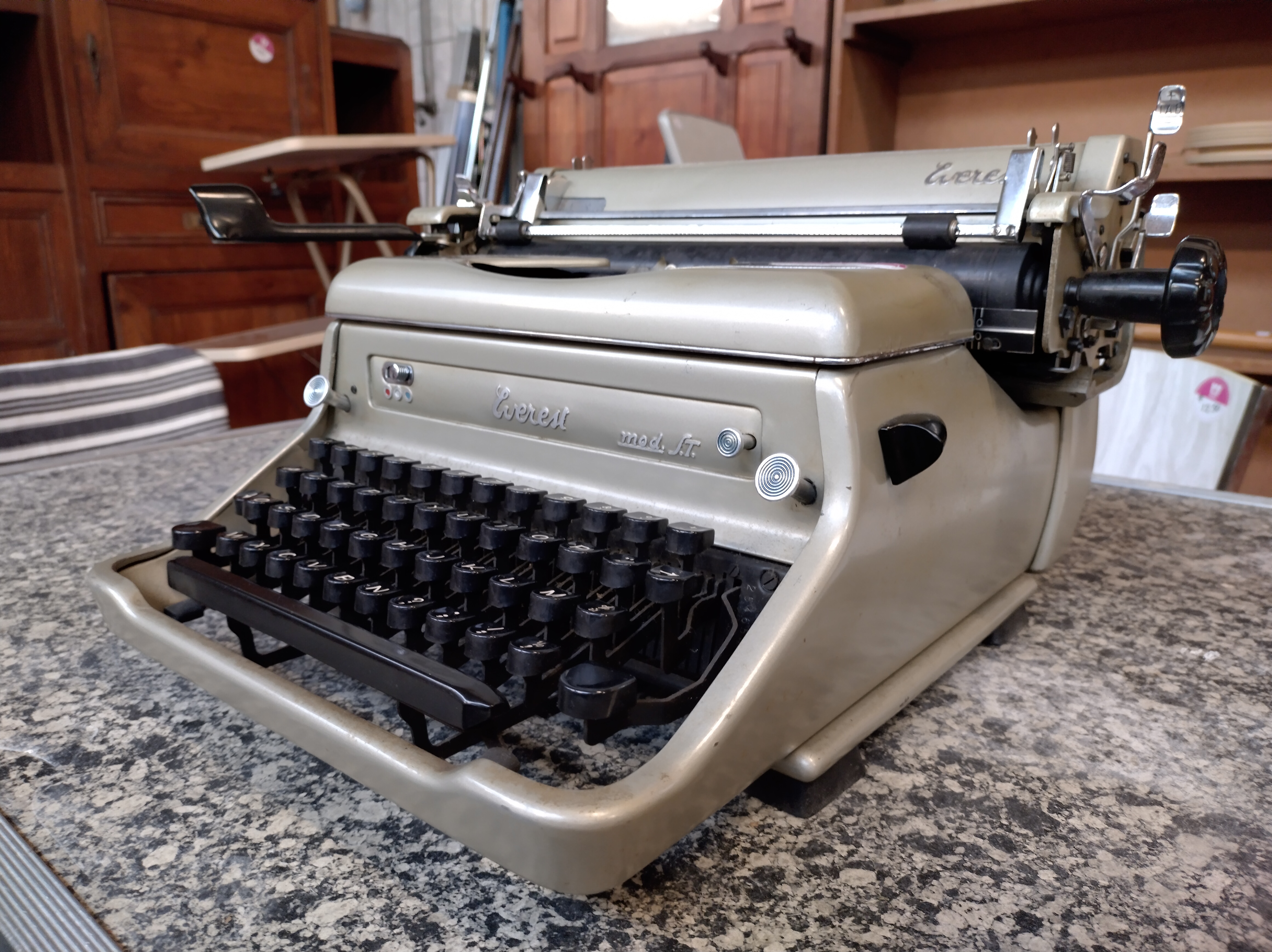
Afgelopen oktober kocht ik een schilderij van het kruispunt Boezemlaan-Soetendaalsekade in Rotterdam, dichtbij de Rotte en de afrit van de A20. In het vorige bericht heb ik zoveel mogelijk informatie over het schilderij bij elkaar gezet, met name over de geschiedenis van de geschilderde plek. Over de schilder, Max Geene, vond ik bijna geen informatie. Ik had alleen een kranteninterview uit 1986. Daaruit bleek dat hij tien jaar daarvoor aan de Rotterdamse kunstacademie had gestudeerd, waarna hij aan de Beeldende Kunstenaars Regeling (BKR) deelnam. Nadat deze regeling was versoberd zat hij ten tijde van het kranteninterview (1986) in de bijstand en woonde met zijn vrouw en zoontje in Overschie.
Googelen en Facebook
De zoektocht naar meer informatie over Max Geene was lastig omdat er ook een Rotterdamse schilder van zee- en havengezichten heeft bestaan met dezelfde naam. Volgens het RKD, het Nederlands Instituut voor Kunstgeschiedenis, was deze Max Geene geboren rond 1929/1930. De schilderijen van hem die online te vinden zijn, hebben een andere, romantischer stijl en zijn gesigneerd in kleine letters, terwijl mijn schilderij is gesigneerd in hoofdletters. Het RKD had geen informatie over de Max Geene naar wie ik op zoek was.
 |
| Signatuur jongere Max Geene |
 |
| Signatuur oude Max Geene |
 |
| Max Geene, foto van Kunstkring Voorne Facebookgroep |
Helaas had niemand uit de Facebook-groep nog contact met Max Geene. Hij zou voor 2020 zijn gestopt met lesgeven en toen al erg slecht gelopen hebben. Een van de cursisten gaf wel een leuk inkijkje in het karakter van Max Geene:
“Ik weet dat zijn vader Rotterdamse havengezichten
schilderde […]. Ik ben zelf in 1987 bij Max gaan tekenen. Hij was toen schat ik
tussen 30 en 40. Hij schilderde zelf stadsgezichten. Maar op een meer
experimentele manier. Ik weet nog dat we eens vroegen wat hij aan het maken
was, toen bracht hij zeer kleurrijk beschilderde krantenpagina's mee. In stijl
niet de opvolger van zijn vader.
Hij was als docent erg inspirerend en zelden echt tevreden.
Als je klaar was zei hij vaak ‘net niet’. Met andere woorden: volgende keer nog
beter. Hij liet me vaak een hele avond tobben om een mooi stilleven neer te
zetten. ‘Aardig maar kan spannender, enz.’
Na die periode geen informatie meer van hem, geen idee of
hij nog leeft of werkt.”
Een andere cursist kon zich vooral nog herinneren dat Max
Geene altijd hamerde op het gebruik van meer kleur.
Na deze hoopvolle start van mijn zoektocht lukte het een
tijd lang niet om meer te weten te komen over Max Geene. Ik leende een paar
boeken uit de bibliotheek die wat uitleg gaven over de context waarin Max Geene
zijn schilderijen maakte. Zo las ik twee
boeken met interviews met Rotterdamse kunstenaars. Max Geene kwam hierbij
zelf niet aan bod, maar wel werd me duidelijk hoe een kunstenaarsbestaan er ná
de BKR uitzag: hard werken in verschillende baantjes, weinig verdienen en sinds
de crisis van 2009 was het helemaal moeilijk.
Lezen, mailen en bellen
Een van de geïnterviewde kunstenaars in de genoemde boeken was
Frans Stuurman. Hij studeerde net iets voor Max Geene af aan de Rotterdamse Kunstacademie,
woont en werkt nog steeds in dezelfde buurt als waar Max Geene zijn kruispunt
schilderde en is gespecialiseerd in stadsgezichten, in een soortgelijke
no-nonsense stijl. Ik heb Frans
Stuurman daarom gebeld om te vragen of hij weleens van hem had gehoord. Dat
bleek, ondanks de vele overeenkomsten, niet het geval.
 |
| Frans Stuurman, Fontaine-l'Evêque, 2020 |
Ook kunstenaar Anne Geene vond het een leuke vraag, maar had nog nooit van collega kunstenaar Max Geene gehoord, liet ze me per mail weten. Ook veel andere van mijn pogingen om iets meer te weten te komen over Max Geene liepen op niets uit: mailtjes naar vroegere werkgevers waar hij schilderles had gegeven, Facebook-berichten en telefoontjes naar Rotterdammers met “Geene” als achternaam, berichten op kunst-fora: allemaal zonder resultaat.
Een ander boek dat enig inzicht gaf in de werkomstandigheden van Max Geene was “Een monument voor de BKR”, van Fransje Kuyvenhoven, uit 2020. Het schetst een beeld van overvolle BKR-depots, administratieve chaos en frustratie. En een eeuwigdurende strijd van kunstenaars om de regeling te verbeteren, en later, te behouden. Dat lukte uiteindelijk niet. In 1987 werd de regeling helemaal afgeschaft.
 |
| Achterkant van het schilderij van Max Geene, BK94263 |
Achterop het paneel van het schilderij van Max Geene staan
meerdere nummers. Een van de nummers is BK94263. Volgens het boek van
Kuyvenhoven betekent dit nummer dat het het 194.263ste kunstwerk is dat
via de BKR-regeling werd ingeleverd. De eerste 100.000 werken kregen als
voorvoegsel SZ, daarna kwam BK en de laatste serie begon met DV. In totaal ging
het om meer dan 221.000 kunstwerken.
 |
| Een monument voor de BKR, datering BKR-werken, bladzijde 296. Klik om te lezen. |
In 1982 werden er 13.630 kunstwerken bij de BKR ingediend,
met nummers tussen BK94063 en DV7693. Het schilderij van Max Geene kreeg dus in
1982 het inventarisnummer BK94263. Op de achterkant staat echter “1979”. Het
affiche van Henk Elsink dat op het schilderij is afgebeeld hoort ook bij de
voorstelling “Theater en Thuis” die hij begin 1979 in Rotterdam speelde. Ik
weet niet of de BKR-regels het toelieten om ouder werk in te dienen, maar daar lijkt het wel op.
Een ander nummer dat achterop het paneel staat, R44189,
bleef een mysterie, tot ik het Stadsarchief Rotterdam bezocht, eind januari
2026.
Stadsarchief Rotterdam
Ik had het Stadsarchief Rotterdam al meerdere mailtjes
gestuurd, omdat deze het Rotterdamse Archief van de Commissie Complementaire
Arbeidsvoorziening Beeldende Kunstenaars in beheer heeft. Dit was, volgens de
archiefomschrijving, de gemeentelijke voorpost van de landelijke
BKR-regeling, van waaruit 75 procent van de aangekochte werken naar het Rijk
werden gestuurd.
Ook heeft het stadsarchief een serie jaarverslagen van de
Kunstacademie (voluit: Academie van Beeldende Kunsten en Technische
Wetenschappen te Rotterdam) in bezit. Ik had de Kunstacademie zelf al eerder om
meer informatie over Max Geene gevraagd. Zij konden vanwege privacywetgeving geen
informatie delen, maar wezen wel naar de jaarboeken, omdat daar per jaar een
lijst van gediplomeerden in zou staan.
 |
| Ingang Stadsarchief Rotterdam, januari 2026 |
Eenmaal in het Stadsarchief stonden de opgevraagde
jaarboeken en het BKR-commissie-archief al voor me uitgestald. Ik begon met de
jaarboeken. Uit het kranteninterview met Max Geene wist ik dat hij halverwege
de jaren zeventig moest zijn afgestudeerd. En inderdaad, in het jaarverslag van
1978 komt de naam “Max Geene” voor. Op bladzijde 28 staat hij tussen de tien
kandidaten die examen hadden gedaan in de avondopleiding “Vrije teken-,
schilder- en grafische kunst”. De andere negen kandidaten van examenjaar
1977-1978 waren Erica Hagoort, Roy Dorder, Rik Sluiter, Douwe Rijpsma, Annie
Jansen, Sjaak de Lange, Rik Messemaker, Peter Trouwborst en Willem de Boer.
 |
| Jaarverslag Kunstacademie Rotterdam, afstudeerlijst. Klik om te lezen. |
Hierna ging ik verder met een map brieven van kunstenaars aan de BKR-commissie Rotterdam (archief 951, inventarisnummer 52). De map bevatte correspondentie over afgewezen BKR-aanvragen en informatie over gebruikte materialen en kostprijzen die bij de opgestuurde kunstwerken hoorde. Van Max Geene vond ik één klein, maar wel heel mooi, handgeschreven bedelbriefje:
 |
| Briefje van Max Geene aan de BKR-Commissie, 6 april 1979. Klik om te lezen. |
“Aan de Comm. van de BKR Rotterdam,
6 april, ‘79
Graag zou ik zien dat mijn honorarium wordt verhoogd,
aangezien ik mijn schilderijen gedurende de huidige voorzieningsperiode niet
kan doorwerken zoals ik dat graag zou willen doen.
Hoogachtend, Max Geene, Delfgaauwstraat 36B, ROTTERDAM”
Het is niet veel en de zin is krom, maar het is toch in
ieder geval de bevestiging dat Max Geene in de BKR zat.
Andere mappen bevatten lange lijsten met aankopen van
kunstwerken per voorzieningsperiode (kwartaal): “beoordeling van de ingediende
werkstukken door de Commissie complementaire arbeidsvoorziening beeldende
kunstenaars ten behoeve van de Beeldende Kunstenaars Regeling”. Gelijk bij de
eerste map (inventarisnummer 44, “beoordeling in de vergadering van 16 en 17
januari 1979”) was het op de tweede bladzijde al raak: op de lijst staan vier
werkstukken van M.J. Geene (nummer R32018 t/m R32021), allemaal olieverf op
80x100cm formaat, a 2.000 gulden per stuk.
De aankooplijsten zijn geordend op R-nummer. Hierdoor is nummer
R44189 (van mijn schilderij) makkelijk terug te vinden. De aankoopgegevens
hiervan staan in de map met inventarisnummer 45, op de lijst van ingezonden
werkstukken voor de vergadering van de commissie op 13 t/m 15 oktober 1981. Niet
veel later werd het schilderij dus doorgestuurd naar de landelijke BKR.
Naast R44189 leverde M.J. Geene tijdens deze
voorzieningsperiode ook werken met de R-nummers 44188 en 44190 in. Ook hier ging
het weer om olieverf van 80x100cm.
 |
| Aankooplijsten BKR-Commissie, Stadsarchief Rotterdam. Klik om te lezen. |
Dit keer kreeg Max Geene er 3.000 gulden (1.361 euro) per schilderij
voor. Het handgeschreven briefje met het verzoek voor een hoger honorarium zal
hier weinig invloed op hebben gehad; alle kunstwerken van dit materiaal en
formaat werden voor ongeveer hetzelfde bedrag aangekocht.
De laatste map met informatie over Max Geene (inventarisnummer
39), bevat correspondentie over de neveninkomsten van kunstenaars. Hierin zit
een briefje gedateerd 10 maart 1984, waarin de secretaris van Teken-, schilder-
en boetseerclub A’72 aangaf dat Max Geene “sinds enkele jaren op free lance
basis aan onze vereniging is verbonden”. In de bijlage bij de brief werd hij
overigens M. Geene jr. genoemd. Een bevestiging dat zijn vader ook zo heette.
 |
| Neveninkomsten Max Geene jr. 10 maart 1984, Stadsarchief Rotterdam. Klik om te lezen. |
Rijksdienst voor het Cultureel Erfgoed
De Rijksdienst voor het Cultureel Erfgoed (RCE) beheert het
nationale BKR-archief, met alle gegevens van ooit bij het Rijk ingediende
werken. Het is echter niet voor derden toegankelijk. Gelukkig wilde een
conservator de archieven wel doorzoeken naar informatie over de door Max Geene
ingediende werken.
De conservator van de RCE stuurde me een foto van de
oorspronkelijke BKR-registratie in het inventarisboek met daarin ook “mijn”
schilderij, met BKR-nummer BK94263. Bij de registratie staat ook nog het oude,
Rotterdamse nummer R44189 en de datum waarop het in het depot werd opgenomen,
of in bruikleen werd gegeven. Dat was op 24 augustus 1982. Het werd toen op
transport gezet naar het Wijkgezondheidscentrum Assen.

 |
| BKR-registratie BK94263 in inventarisboek Rijksdienst voor het Cultureel Erfgoed. Klik om te lezen. |
Het gaat hier mogelijk om het Wijkgezondheidscentrum
Assen-Noord aan de Molenstraat 262, dat een maand later feestelijk zou worden
geopend, maar al wel sinds 17 juni 1982 in bedrijf was (bron: Nieuwsblad van
het Noorden). Het is de laatste jaren gerenoveerd, maar in 1997 moet het er nog
ongeveer uit hebben gezien als bij de opening in 1982:
 |
| Wijkgezondheidscentrum Assen-Noord, Drents Archief |
Daarnaast ontving ik van de conservator van het RCE een
computeruitdraai waarop per schilderij de “huidige standplaats” en het
BKR-nummer staat vermeld.
 |
| Uitdraai registraties kunstwerken BKR Max Geene, Rijksdienst voor het Cultureel Erfgoed. Datum onbekend. Klik om te lezen. |
Dit overzicht bevat 27 werken van Max J. Geene die door de Rotterdamse BKR-commissie naar de Rijksdienst zijn gestuurd. Gezien de BK en DV-nummers op de lijst, zijn deze tussen 1979 en 1984 daar aangekomen. Niet alle werken van Max J. Geene die op de Rotterdamse aankooplijst staan, zijn ook op deze lijst terug te vinden. Dat klopt met de archiefomschrijving die ik eerder in het Stadsarchief van Rotterdam vond: ongeveer 75 procent van de in Rotterdam ingediende werken werd naar de Rijksdienst gestuurd. Het is mij niet bekend welke criteria werden gehanteerd bij het maken van de schifting.
Duidelijk is wel dat veel van zijn kunstwerken nog ergens
rondhangen. “Mijn” schilderij BK94263 staat op de lijst met als aantekening
“vermissing bij bruikleennemer”. Onder Standplaatshistorie staat “Historisch
Centrum Overijssel”.
Hoewel niet duidelijk is wanneer deze lijst voor het laatst
is geactualiseerd, geeft deze benaming wel een hint, want het Historisch
Centrum Overijssel werd pas in 2001 opgericht, als fusie-organisatie van het
voormalige Gemeentearchief van Zwolle en het voormalige Rijksarchief van
Overijssel. Eind 2021 is de naam weer veranderd naar Collectie
Overijssel.
Archief van de Collectie Overijssel
Ik had de Collectie Overijssel al op 17 oktober 2025 gemaild
met de vraag om meer informatie over het schilderij. Vrij snel daarna kreeg ik
antwoord dat er niets in hun systemen was te vinden over het schilderij.
Gelukkig kreeg ik bijna drie maanden later een nieuwe mail, waarin een
collectiebeheerder van de Collectie Overijssel meedeelde toch nog verder
gezocht te hebben. Hij had contact opgenomen met de gemeente Zwolle en voegde
de volgende puntige (maar heel waardevolle) notitie toe:
“De historie die ik nog kon checken in oud bestand geeft aan
dat het een gift rijk betrof. (2001) inderdaad kenmerk BK94263. Het heeft
volgens registratie vanuit kunstuitleen (KUZ 538.001) gehangen bij Politie
IJsselland. Vanuit ontzameling aan onterfdgoed afgestaan. (Categorie 3).”
Mijn schilderij is dus in 2001 aan de Gemeente Zwolle geschonken en in de periode daarna aan een organisatie voor kunstuitleen overgedragen (mogelijk Kunstuitleen Zwolle, want daar staat KUZ voor). Van daaruit heeft het kennelijk bij de Politie IJsselland gehangen, waarna het via de stichting Onterfd Goed bij mij is terechtgekomen. Het door de Collectie Overijssel genoemde nummer (538.001) staat ook op de achterkant van het schilderij, maar dan met de letter G ervoor.
Het is mij nog niet helemaal duidelijk hoe dit te rijmen is met de uitdraai van het RCE waarop het schilderij als vermist wordt opgegeven, en wat de link is met het in de uitdraai genoemde Historisch Centrum Overijssel. Ik vermoed dat het schilderij eerst door de RCE in 2001 aan de Gemeente Zwolle is overgedragen. De depots en archieven van de Gemeente Zwolle werden vanaf dat jaar beheerd door het Historisch Centrum Overijssel. Daar zal het vermist zijn geraakt. Op enig moment zal het schilderij zijn teruggevonden en in de kunstuitleen terecht zijn gekomen, waarna het op het hoofdbureau van de Politie IJsselland in Zwolle heeft gehangen.
Ik heb contact opgenomen met Kunst in huis, die in 2017
Kunstuitleen Zwolle hebben overgenomen. Helaas konden zij in hun systemen geen
informatie meer vinden over Max Geene of zijn schilderij: “ik vrees dat het te
lang geleden is”. Hetzelfde geldt voor de curator (Benthem Gratama Advocaten) die
het faillissement van Kunstuitleen Zwolle in 2017 regelde; ook zij hadden geen
informatie over de inventaris bewaard. Daarnaast heb ik geprobeerd contact op
te nemen met de politie IJsselland, maar tot nu toe zonder resultaat.
Met “Politie IJsselland” wordt overigens hoogstwaarschijnlijk
het hoofdbureau van de politie Zwolle aan de Koggelaan 8 bedoeld. Volgens Bagviewer
is dit grote kantoorpand in 2001 gebouwd. Mogelijk hadden ze na de oplevering
behoefte aan wat kunst aan de nog kale muren.
 |
| Politie IJsselland, Koggelaan 8, Zwolle. Google Streetview |
Samenvatting van de reis van het schilderij:
1979 (begin): Geschilderd door Max J. Geene
1981 (oktober): Ingediend bij Rotterdamse BKR-Commissie
1982 (begin): Opgestuurd naar Centrale BKR (Rijksdienst)
1982 (augustus): In bruikleen bij Wijkgezondheidscentrum
Assen
2001: Gift Rijksdienst aan Gemeente Zwolle
Ergens tussen 2001 en 2021: Standplaats Historisch Centrum Overijssel,
Ergens tussen 2001 en 2021: Vermist bij bruikleennemer
Na 2001: Via Kunstuitleen (Zwolle?) bij Politie IJsselland
2025: Via Stichting Onterfd Goed aangekocht door mijzelf.
Genealogisch onderzoek
In een eerder stadium had ik al wat genealogisch gegoogled
naar Max Geene en zijn vader, maar liep stuk op de grote hoeveelheid Max
Geene’s in de Rotterdamse geschiedenis. In de aankooplijsten van de Rotterdamse
BKR-commissie wordt Max Geene met voorletters vermeld: “M.J. Geene”. Met die
voorletters kon ik gerichter zoeken dan alleen op de naam “Max Geene”.
Informatie uit de burgerlijke stand wordt pas vijftig jaar
na sterven, of honderd jaar na geboorte openbaar gemaakt. Dat is dus (nog) geen
ingang voor meer informatie over vader of zoon Max Geene. Wel staan er foto’s
van grafzerken en bidprentjes online. Hierdoor heb ik een paar maanden gedacht
dat een zekere Maximiliaan Christiaan Geene, geboren te Rotterdam in 1929 en
gestorven te Sint Michielsgestel in 2014, de vader van Max Geene zou zijn. Maar
deze Maximiliaan had vier zonen met heel andere namen en kon dus niet de vader
van Max zijn.
Het Centrum voor Familiegeschiedenis (CBG) houdt het Nationaal Register van Overledenen (NRO)
bij. Dit wist ik niet, maar is een makkelijke manier om buiten het
bevolkingsregister om te checken of iemand is overleden. Voor minder dan 5 euro
kun je met gebrekkige data (zoals in mijn geval alleen een achternaam, 2
voorletters, vermoedelijke geboorteplaats en vermoedelijke geboortedatum) al
een uittreksel van de overledene ontvangen. Ik diende daarom een verzoek in
voor Max J. Geene, geboren in of rond Rotterdam, rond 1953.
Twee dagen later kreeg ik het resultaat. Mijn schilder
heette voluit Maximilian Jacobus Geene, geboren op 15-08-1951 te Rotterdam en, heel
recent overleden, op maandag 29 september 2025. Zes dagen later, op
zondagochtend 5 oktober, kocht ik het schilderij van de website van de
Stichting Onterfd Goed.
 |
| Uittreksel Max J. Geene, Centrum voor Familiegeschiedenis, Nationaal Register van Overledenen. Klik om te lezen. |
De werkelijke vader van Max J. Geene staat ook op het
uittreksel: Maximilian Christian Geene, geboren op 16 augustus 1930 te
Rotterdam en overleden op 11 april 2010 te Rotterdam. Dat is dus de schilder
van haven- en zeegezichten. De informatie van het RKD over Max Geene kan dus worden
aangescherpt: hij is in 1930 geboren. Misschien is het ook een goed idee om er
de tussenletter C. bij toe te voegen (Max C. Geene), om hem zo te onderscheiden
van Max J. Geene.
Grappig, maar ook verwarrend, is dat de vader van Maximilian
Christian (*1930) bijna hetzelfde
heette: Maximilian Christian Herman (*1900). En diens vader heette weer
Maximilian Christian (*1858). Uit gegevens van het Stadsarchief Rotterdam
blijkt dat deze schipper (geboren in 1858 te Emmerich, Duitsland) met een
Rijnschip in Rotterdam aankwam. Hij liet zich in 1912 naturaliseren
tot Nederlander.
 |
| Registratie familie Geene, Stadsarchief Rotterdam. Klik om te lezen. |
De schilder van mijn schilderij (Max J. Geene, geboren 1951)
had dus een vader, grootvader en overgrootvader die allemaal Max heetten.
Volgens het uittreksel van het CBG kreeg Max J. Geene op 21 januari 1979 een
zoon. Hij brak met de familietraditie en noemde hem geen Max, maar Vincent. Uit
het kranteninterview uit 1986 blijkt inderdaad dat hij enige jaren voor het
interview een peuter rond had lopen.
Dat Max J. Geene eind januari 1979 vader werd, maakt de
cirkel mooi rond. Mijn schilderij is (aan de hand van het affiche van Henk
Elsink) te dateren in dezelfde periode als waarin zijn zoon werd geboren. Hij
moet bij het schilderen van het kruispunt (of het eerst fotograferen ervan) bijna,
of net vader zijn geworden. Ook het handgeschreven briefje aan de Rotterdamse
BKR-commissie van begin april 1979, waarin hij een hoger honorarium vraagt, wint
aan betekenis. Mogelijk kwam hij minder aan schilderen toe door de
gezinsuitbreiding.
Andere schilderijen van Max J. Geene
Begin december 2025, ruim drie maanden na zijn dood, veilde
Vendu Rotterdam vier
schilderijen van Max Geene. Hoewel ze alle vier zijn toegeschreven aan “Max
Geene (1929-2008)”, zijn het overduidelijk twee schilderijen van de “jongere”
Max J. Geene, geschilderd en ondertekend in dezelfde stijl als mijn schilderij. Er staan een
parachutist boven een stad en een boot in de haven op. Het zijn de enige andere
schilderijen van Max J. Geene die ik tot nu toe heb gezien. Achterop het tweede
schilderij staat hetzelfde adres als waarmee Max Geene zijn verzoek om een
hoger honorarium in 1979 ondertekende.
 | ||
Boats in the harbour, Vendu Rotterdam
|

 |
| Paratrooper over a city, Vendu Rotterdam |
De andere twee schilderijen zijn hoogstwaarschijnlijk wel van zijn vader, Max C. Geene (1930-2010), gezien onderwerpkeuze, signatuur in kleine letters en stijl. Het zal niet toevallig zijn dat alle vier de schilderijen in deze veiling begin december 2025 opdoken, aangezien Vendu Rotterdam veel geveilde objecten uit woningontruiming bij sterfte haalt, en Max J. Geene ruim twee maanden eerder overleed. De schilderijen van Max J. Geene werden voor respectievelijk 60 en 90 euro verkocht, terwijl die van zijn vader op 70 euro werden afgehamerd. Ik heb de herkomst van de schilderijen nog bij Vendu nagevraagd, maar daar konden ze geen uitspraken over doen, in verband met de privacy.
 |
| Vendu Rotterdam, veiling schilderijen Max J. Geene en Max C. Geene, 10 en 11 december 2025. Klik voor details. |